How to use skins
Introduction
Everyone knows that every man to his own taste. So the skin supporting is one of the most important things to make the program to look like you prefer. Zentimo supports skin changing for the stopping menu and some other frequently displayed windows.
The current article describes how to use skins and how to create your own unique skin.
How to use skins
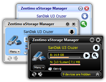
The program installation pack contains several predefined skins, such as “Classic”, “Black Velvet” and “Black Contrast” color schemes. See on the screenshot below to know how to change a skin:
Just go to the “Skins” tab of the program options, choose your preferable skin and click OK.
Easy, isn’t it?… Don’t like any of the predefined skins and wish to make your own one?
How to create your own skin
First of all browse the folder of any predefined skin (e.g. “C:/Program Files/Zentimo/Skins/Black Velvet”) to know what files the skin consists from, then do the following:
- Create a new folder with the name of a new skin (e.g. “C:/Program Files/Zentimo/Skins/My Own Skin”).
- Create images following specified names using your favorite graphic editor. The easiest way to not miss an image is to copy all images from an existing skin folder to your new skin folder. Then you can edit just copied images in a graphic editor. If an image file is not found by the program it will use an equivalent file from the Default skin built into the program (you won’t see a folder or any files for the default skin).
- Create the text file “colorscheme.ini”. This configuration file is used to define color and shape of the interface controls. Find the list of parameters and their description below.
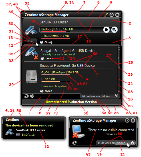
Color scheme parameters:
- background – color of the window background.
- selecteditemtop – the top part of the device item gradient fill.
- selecteditembottom- the bottom part of the device item gradient fill.
- selectedsubitemtop – the top part of the drive item gradient fill.
- selectedsubitembottom – the bottom part of the drive item gradient fill.
- menuheadertext – the color of the header caption in the stopping menu and notification window.
- menuhighlight – the top part of the header gradient fill.
- menushady – the bottom part of the header gradient fill.
- menushadow – the color of the header underline.
- link – the reference link color in normal state.
- linkincontrol – the reference link color in mouse control state.
- itemtext – the color of the device name (the device item caption).
- buttontext – the color of the “Menu” button caption.
- subitemtext – the color of the drive name (a device sub-item caption)
- hotkeytext – the color of the hot key text.
- hiddendeviceframe – the color of the frame around the hidden device list.
- selecteditemframe – the color of the device item frame.
- selectedsubitemframe – the color of the device volume item frame.
- hiddendeviceshady – the bottom part of the hidden device list button gradient fill.
- readyforremoving – the “Ready for safe removal” text color.
- hiddendeviceincontrol – a bottom part of the hidden device list button gradient fill in mouse control state.
- hiddendevicehighlight- a top part of the hidden device list button gradient fill.
- scrollbarframe – the color of the scroll bar frame.
- scrollbarfill – the color of the scroll bar fill.
- scrollbarsliderframe – the color of the scroll bar slider frame.
- scrollbargrad1 – a right part of scroll bar slider gradient fill.
- scrollbargrad2 – a left part of scroll bar slider gradient fill.
- scrollbarbtnframe – the color of the scroll bar button frame.
- scrollbarhighlight – is not used yet
- buttonframe – the “Menu” button frame color.
- buttonhighlight – a top part of the “Menu” button gradient fill.
- buttonshady – a bottom part of the “Menu” button gradient fill.
- buttonshadyincontrol – a bottom part of the “Menu” button gradient fill in mouse control state.
- textshadow – the color of header caption shadow in the stopping menu and the notification window
- windowlefttopadge – a top and left hand outside line color of the frame around window.
- windowrightbottomadge – a bottom and right hand outside line color of the frame around window.
- windowlefttopinneradge – a top and left hand inside line color of the frame around window.
- windowrightbottominneradge – a bottom and right hand inside line color of the frame around window.
- windowfillframe – the color of the the frame around window fill.
- windowlefttopinneradge2 – the color of the line inside the frame around window at the top and left hand side.
- windowrightbottominneradge2 – the color of the line inside the frame around window at the bottom and right hand.
- windowhighlight – the color of a highlighted gradient fill of the frame around window.
- emptymenutext – the color of the text shown when there are no visible connected devices.
- progressbarfill – tbe color of a free space progress bar fill.
- progressbarframe – the color of a free space progress bar frame.
- freespaceemptydark – the color of the dark fill of the drive free space progress bar when a drive is empty.
- freespaceemptylight – the color of the light fill of a drive free space progress bar when a drive is empty.
- freespacemiddledark- the color of the dark fill of a drive free space progress bar when a drive is half-full.
- freespacemiddlelight – the color of the light fill of a drive free space progress bar when a drive is half-full.
- freespacefulldark – the dark fill color of a drive free space progress bar when a drive is full.
- freespacefulllight – the light fill color of a drive free space progress bar when a drive is full.
- infofill – the filling color of the stopping menu information panel.
- infoframe – the color of the the stopping menu information panel frame.
- showndeviceseparator – the color of the separating line between device items in the visible device list of the stopping menu.
- hiddendeviceseparator – the color of the separating line between device items in the hidden device list of the stopping menu.
- ballooncaptiontext – the color of the caption in the notification window.
- underlinedlink – the color of the underlined reference link in the normal state.
- underlinedlinkincontrol – the color of the underlined reference link in hovered state (when it’s mouse hovered)
- enablewindowframe – “boolean parameter” (should be “0”(false) or “1”(true)) – defines whether a window needs to have an around frame.
- enableitemchamferframe – “boolean parameter” (should be “0”(false) or “1”(true)) – defines whether items and sub-items of the stopping menu need to have a frame with chamfer corners.
How to set color:
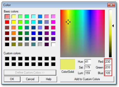
The “colorscheme.ini” file mainly consists from the lines like the following: “subitemtext=$0069E9E6”. The right part of the line is a color value assembled from R-G-B components in the hex format. Thus $0069E9E6 defines RGB color value with the following values of its parts: Red=E6(230), Green=E9(233), Blue=69(105). You can see this color on the screenshot below:


[…] “Classic”, “Black Contrast”, “Black Velvet”. Furthermore you can create your own skin and share it with […]
Hello:
Before I go to the trouble of creating my own “skin”, will the next version (which I am not entitled to (by virtue of Give Away of the Day) change the skin parameters so that I will have to re-do it all in the event of an new version?
Thanks for an excellent program and for sharing it with the world via GAotD!!
Louis M. Ayers
Hi Louis,
I’m sorry for so late response. The next version that will came soon will have the same skin format. But of course we may change it in future.
And feel free to send us your own skin if you wish to share it with other we will publish it with pleasure. If we like it we also will be happy to reward you with the license.
Зўр дастур экан. Шахсан менга ёқди бундай дастурларни кўпдан кўп чиқармоғлиқ зарур, керак бўлса лозим ва лобуд.